
Google Chrome 145 shipped with two new CSS properties that most business owners will never hear about. But these features, column-wrap and column-height, solve a layout problem that has quietly hurt conversion rates and search rankings for years. If your site uses multi-column layouts for blog posts, product grids, or directory listings, this update matters more than you think.
The Hidden UX Problem in Multi-Column Layouts
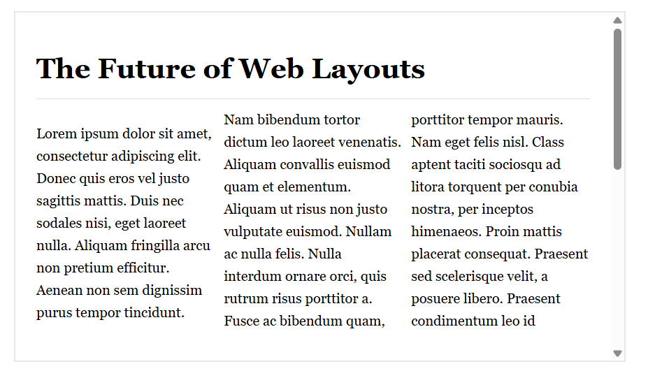
Multi-column CSS has existed since 2011. Designers loved the concept: split content into newspaper-style columns for better readability and visual interest. The execution, however, was broken from day one. When content exceeded the container width, browsers forced a horizontal scroll. Nobody scrolls horizontally on the web. It feels wrong, breaks the reading flow, and sends users bouncing back to search results.
For years, developers worked around this with JavaScript hacks, complex flexbox configurations, or simply avoided multi-column layouts altogether. The new column-wrap property finally makes the feature usable by wrapping excess columns into new rows below, creating the vertical scroll users expect. It’s a small fix with big implications for how we structure content on responsive sites.
Why Layout Decisions Belong on Your On-Page SEO Checklist for Small Business
Most on-page SEO checklists focus on meta tags, header hierarchy, and keyword density. Those elements matter, but Google’s ranking algorithm increasingly rewards user experience signals. Bounce rate, time on page, scroll depth, and mobile usability all feed into how your pages perform in search. A layout that forces horizontal scrolling or breaks on mobile devices will hurt those metrics, even if your title tags are perfect.
We’ve seen this pattern repeatedly with clients. A site ranks well initially, then traffic plateaus or declines despite fresh content. The culprit is often technical: slow load times, broken layouts on certain devices, or content structures that confuse both users and crawlers. SEO Services should address these layout and performance issues alongside traditional optimization.
The new CSS wrapping features matter because they make previously risky layout patterns safe to use. If you’ve been avoiding multi-column designs because of the horizontal scroll issue, you now have a clean solution. Better layouts mean better engagement. Better engagement signals to Google that your content satisfies search intent. The chain of causation is direct.
Steps to Update Your On-Page SEO Checklist for Small Business Sites
Here’s how to incorporate these layout considerations into your existing optimization process:
Audit existing multi-column implementations. Search your stylesheets for ‘column-count’ or ‘columns’ properties. Test those pages on narrow viewports (around 375px width). If you see horizontal scrollbars, you’ve found a problem worth fixing. Chrome DevTools mobile emulation makes this quick. Document every instance where content breaks or creates awkward scrolling patterns.
Add column-wrap to new layouts cautiously. The property works beautifully for fixed-height content blocks like card grids where each item has predictable dimensions. It’s less reliable when content length varies wildly. Test thoroughly before deploying to production. Run Lighthouse audits before and after to confirm you’re not introducing new layout shifts or performance hits.
Consider viewport-height column designs for long-form content. Setting column-height to match viewport height (100dvh) creates a pagination effect that works well for articles, case studies, or tutorial content. Users scroll vertically through discrete sections rather than one endless column. This approach can increase time on page if executed thoughtfully, though it requires careful content planning to avoid awkward breaks mid-paragraph.
Test across browsers before relying on these properties. As of April 2026, only Chrome 145 and newer support column-wrap and column-height. Firefox, Safari, and Edge don’t recognize them yet. That’s roughly 65% of global browser share that won’t see your intended layout. You need fallback styles that maintain usability for everyone else. Use feature queries (@supports) to apply the new properties only where supported, with graceful degradation for older browsers.
Monitor Core Web Vitals after layout changes. Google Search Console reports Cumulative Layout Shift (CLS), Largest Contentful Paint (LCP), and Interaction to Next Paint (INP). Any significant layout modification can impact these metrics. If your CLS score jumps after adding multi-column wrapping, you’ve likely introduced a rendering issue that needs fixing. These signals directly influence rankings, especially on mobile.
For Small and Local Businesses
If you’re running a small business site, you probably don’t have a dedicated front-end developer monitoring CSS specification updates. That’s fine. The practical takeaway is simpler than the technical details: avoid layout patterns that force horizontal scrolling, especially on mobile devices. That’s been true for years. The new Chrome features just make it easier to implement certain designs correctly.
Your actual on-page SEO checklist for small business sites should prioritize fundamentals first. Make sure your pages load quickly (under 2.5 seconds). Ensure your content is readable without zooming on phones. Use clear headings that outline your content structure. Include relevant internal links to related pages and services. Answer the questions your target customers are actually asking in search. These basics drive more results than advanced CSS tricks.
That said, if you’re redesigning your site or working with a developer on a custom theme, mention this wrapping functionality. It opens up layout options that were previously off-limits. A well-designed multi-column layout can make dense information (service lists, product catalogs, team directories) more scannable and engaging. Just make sure whoever implements it tests thoroughly across devices and browsers.
One concrete example: local service businesses often list service areas or service types in long vertical lists. These could work well as wrapped multi-column layouts, showing more information above the fold without overwhelming the visitor. But only if the implementation doesn’t break on the 35% of users not using Chrome. The feature is useful, not essential. Use it where it genuinely improves the experience, not just because it’s new.
The Bigger Pattern: UX and SEO Continue to Merge
This CSS update is a small example of a larger shift. Google’s algorithm no longer draws a clear line between ‘technical SEO’ and ‘user experience.’ They’re the same thing now. A site that loads slowly, displays poorly on mobile, or creates confusing navigation patterns will underperform in search regardless of content quality. The inverse is also true: a technically sound site with poor content won’t rank well either. You need both.
For businesses managing their own marketing, this convergence means your optimization checklist must include items that sound more like web development than traditional SEO. Page speed optimization, mobile responsiveness testing, accessibility audits, and layout stability monitoring now sit alongside keyword research and meta tag optimization. It’s a more complex discipline than it was five years ago. Website Development and SEO must work together from the start of any project, not as separate phases.
The good news: many of these technical improvements benefit users directly, even if they never impact rankings. Faster load times reduce bounce rates. Better mobile layouts increase conversion rates. Accessible designs expand your potential audience. You’re not optimizing for an algorithm in a vacuum. You’re building a better website that happens to rank well because it serves visitors effectively.
What to Do This Week
Run a quick mobile usability test on your most important landing pages. Pull up your site on your phone and navigate to your contact page, service pages, and any blog posts you’re trying to rank. Does everything load quickly? Can you read the text without zooming? Do you encounter any horizontal scrolling or broken layouts? If you spot issues, document them and add them to your development queue.
Check your Google Search Console for mobile usability errors. Google flags pages that fail their mobile-friendly test, often due to layout issues, tiny text, or clickable elements too close together. These reports give you a prioritized list of problems Google has already identified on your site. Fix the issues on your highest-traffic pages first.
If you’re planning a site redesign or working with a developer, discuss these new CSS capabilities. They won’t transform your SEO performance overnight, but they do enable cleaner implementations of certain design patterns. Just make sure your development partner includes thorough cross-browser testing and performance monitoring in their process. New features are only valuable if they work reliably for all your visitors.
